
When we think about maps, we often imagine a flat representation of the world. But did you know that the maps we commonly use, such as the Mercator projection, actually distort the size of continents? In this article, we’ll explore the history behind the Mercator projection and how it affects our perception of the world. We’ll also look at alternative map projections that accurately represent the true size of continents and how they can help us better understand our planet.
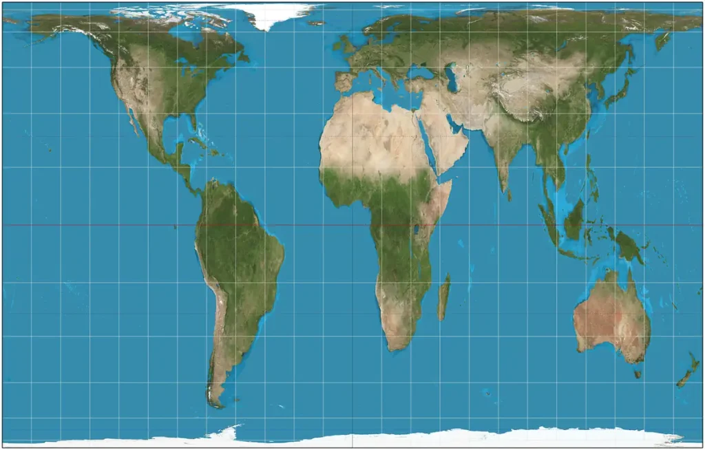
The standard maps we see every day use Mercator Projection, a cylindrical map projection presented by the Flemish geographer and cartographer Gerardus Mercator (1512-1594) in 1569. It was developed for navigational purposes and has often been used in world maps. But, like all the other types of projections, it can be deceptive.
In fact, every map tells lie, more or less, since it’s impossible to transform perfectly the three-dimensional world into two-dimensional surfaces like paper or computer screens.
Map projections are necessary for creating maps and every map projections distort the surface in some fashion (a map projection is a systematic transformation of the latitudes and longitudes of locations on the surface of a sphere or an ellipsoid into locations on a plane).
So, every map projection introduces distortion, and each has its own set of problems.
The history of the Mercator projection and its purpose
Gerardus Mercator was a Flemish cartographer who created the Mercator projection in 1569. The purpose of this projection was to solve a navigational problem: how to plot a straight course between two points on a globe but display it on a two-dimensional map. The Mercator projection did this by creating a rectangular map where the longitude and latitude lines formed a grid of right angles. This allowed sailors to plot a straight course by following a constant compass bearing.
One measure of a map’s accuracy is a comparison of the length of corresponding line elements on the map and globe. Therefore, by construction, the Mercator projection is perfectly accurate, k=1, along with the equator and nowhere else.
However, the Mercator projection had a major drawback: it distorted the size of continents. The projection made landmasses near the poles appear much larger than they actually are while shrinking those near the equator. This is why Greenland appears larger than Australia on a Mercator map, despite Australia’s actual size being about 3 times larger.
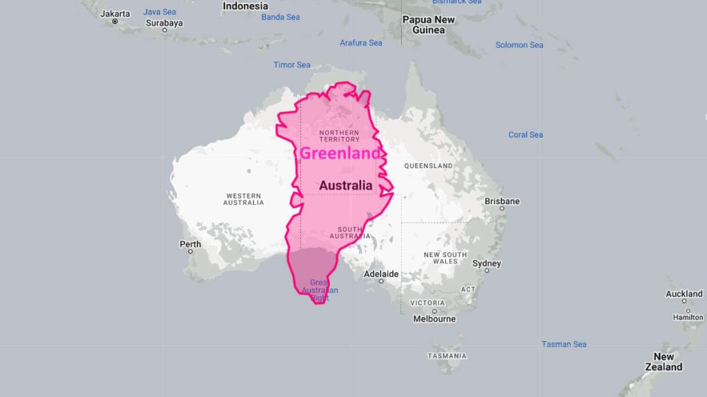
The Mercator projection’s distortion of continent sizes has contributed to cultural biases and misunderstandings. For example, many people who grew up studying Mercator maps are surprised to learn that Africa is not the small continent in the bottom left corner, but is actually larger than the United States, Europe, and China combined. The projection has also been criticized for reinforcing colonialist and Eurocentric views of the world, by giving disproportionate emphasis to Europe and North America.
But the Mercator projection is not completely unsuccessful. The projection preserves “true compass bearings between any two points” and that’s why it has become a standard in nautical navigation. While sacrificing the size, it’s actually a really useful projection for navigation and keeping the correct shape of countries.

How (and why) the Mercator projection distorts the size of continents
The Mercator projection distorts the size of continents because it is a cylindrical projection, which means it wraps the globe around a cylinder and then projects the cylinder onto a flat map. In this process, the latitudes and longitudes are straightened out and appear as parallel lines on the map.
However, as we move towards the poles, the distances between the latitudes get smaller, which causes the landmasses near the poles to appear larger on the map. This is why Greenland, which is located near the North Pole, appears much larger than it actually is, while Africa, which is located near the equator, appears smaller.

Another factor that contributes to the distortion is that the Mercator projection preserves angles, which means that any straight line on the map represents the shortest distance between two points. This is useful for navigational purposes, but it also means that the shape of landmasses on the map is distorted.
As a result, landmasses near the poles appear stretched out and elongated, while those near the equator appear compressed and squat.
Videos: how maps can be deceptive
For some fun facts about the world maps using the Mercator Projection, you can watch the video below.
Another beautiful video on the same subject, titled “How the World Map Looks Wildly Different Than You Think”, was published by the RealLifeLore channel.
All of us have seen a world map at some point in our lives before, but it is very difficult to imagine how certain countries and parts of the world compare to each other in size that is far apart. In this video, we explore why the world looks very different than how it is portrayed in the Mercator Projection map. We then go on to explore how certain countries are unexpectedly larger or smaller than what they appear to be, and how some places look wildly different than our perceptions.
PS; Don’t totally hate the Mercator Projection, it’s actually a really useful map for navigation and for keeping the correct shape of countries while sacrificing the size that we can all laugh about!
The music is by Ross Bugden.
Understanding the true size of continents with alternative map projections
There are several alternative map projections that have been created to accurately represent the true size of continents. One of these is the Peters projection, which was created in the 1970s by German historian Arno Peters. The Peters projection is an equal-area projection, which means that it preserves the relative sizes of landmasses.
This allows for a more accurate representation of the world, where Africa appears much larger than it does on a Mercator map. However, the Peters projection has been criticized for distorting the shapes of landmasses, making them appear stretched out and unfamiliar.
Another alternative projection is the Gall-Peters projection, which was created by James Gall and Arno Peters. This projection is also equal-area, but it preserves the shapes of the continents more accurately than the Peters projection. However, the Gall-Peters projection still distorts the distance and direction between places, which can be problematic for navigational purposes.
A third alternative projection is the Robinson projection, which was created in 1963 by Arthur Robinson. The Robinson projection is a compromise between preserving the shape and size of landmasses, and minimizing distortion. It is not an equal-area projection, but it accurately represents the size and shape of continents across the globe, with less distortion than the Mercator projection.
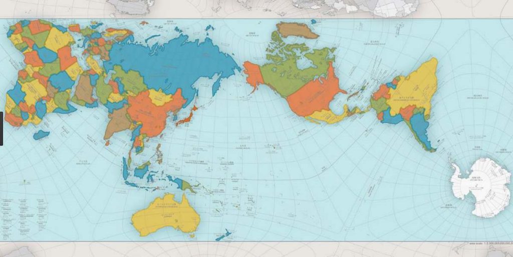
Another alternative is the AuthaGraph, which is dubbed the most accurate world map ever.
Sources
- Mercator projection on Wikipedia
- Map projection on W
ikipedia - True Size Tool website. This app was created by James Talmage and Damon Maneice. It was inspired by an episode of The West Wing and an infographic by Kai Krause entitled “The True Size of Africa“.
- Gall-Peters projection on Wikipedia
- Robinson projection on Wikipedia

- How Many Elephants are Left in the World in 2025? - August 17, 2025
- Moon Landings: All-Time List [1966-2025] - February 2, 2025
- What Is Max-Q and Why Is It Important During Rocket Launches? - January 16, 2025